
Rucio WebUI Endterm Progress Report
Project Recap
Mentors: Mayank Sharma, Martin B, Mario Lassnig
Rucio has proven its potential to be used for providing functionality to scientific collaborations to organize, manage, monitor, and access their distributed data and dataflows across heterogeneous infrastructures. What it needs is a revamped user-friendly UI. This will not only encourage existing users to get a feel of how Rucio continues to grow and reach new milestones, but also increase the adoption of the Rucio WebUI in general. The desired outcomes of my stint would not only involve a complete revamp of the existing UI by building a UI library of our own but also presenting users with a new & intuitive dashboard, keeping the core functionality of Rucio in mind. Rucio also supports multiple types of users and their specific workflows. The first task would involve migrating the WebUI to a pure REST’ful architecture. This would require identifying and implementing new REST endpoints on the Rucio Server and developing a dynamic cross-platform ReactJS application capable of consuming the REST API directly. The second task is to improve the overall user experience for different users. The new dashboard would allow users to get a quick overview of relevant activity and provide quick access to frequently used functionalities.
Coding Period Deliverables
- Make new custom built Rucio-flavoured components.
- Integrate React, Typescript, Webpack & Storybook.
- Integrate the Rucio UI with our custom built components itself, have it up and running.
- Migrate old JS code to new TS code.
- Have Rucio component + usage guides on storybook.
- Finalize on content across various screens.
- Complete development on high priority UI screens and have them migrated.
- Carry out the necessary integration.
- Survey development builds for a11y using WAVE and Accessibility Insights for Web.
- Survey for responsiveness using Chrome Dev Tools.
- Generate Lighthouse reports.
- Write a blog post summarizing everything, and about my performance cum involvement in Rucio.
- Seek daily approvals until everything is finalised.
- Go code upteen times for any minuscule errors.
- Clean code, make sure everything is properly linted and ready before the final closing commits.
- Publish my endterm blog post, rounding up my wholesome journey.
- Seek final approval.
- Present the users with a new Dashboard View.
- Promote the use of CERN attributed works.
- Interact with the community, answer queries or doubts regarding Rucio.
- Carry out maintenance work of the repositories I’ve contributed to.
- Keep resolving relevant issues in the Rucio repositories, making contributions if necessary.
- Leverage experience gained during this period for future endeavors.
Project Milestones
Pages
In total 8 pages were created as a part of this endeavour.
Login Page
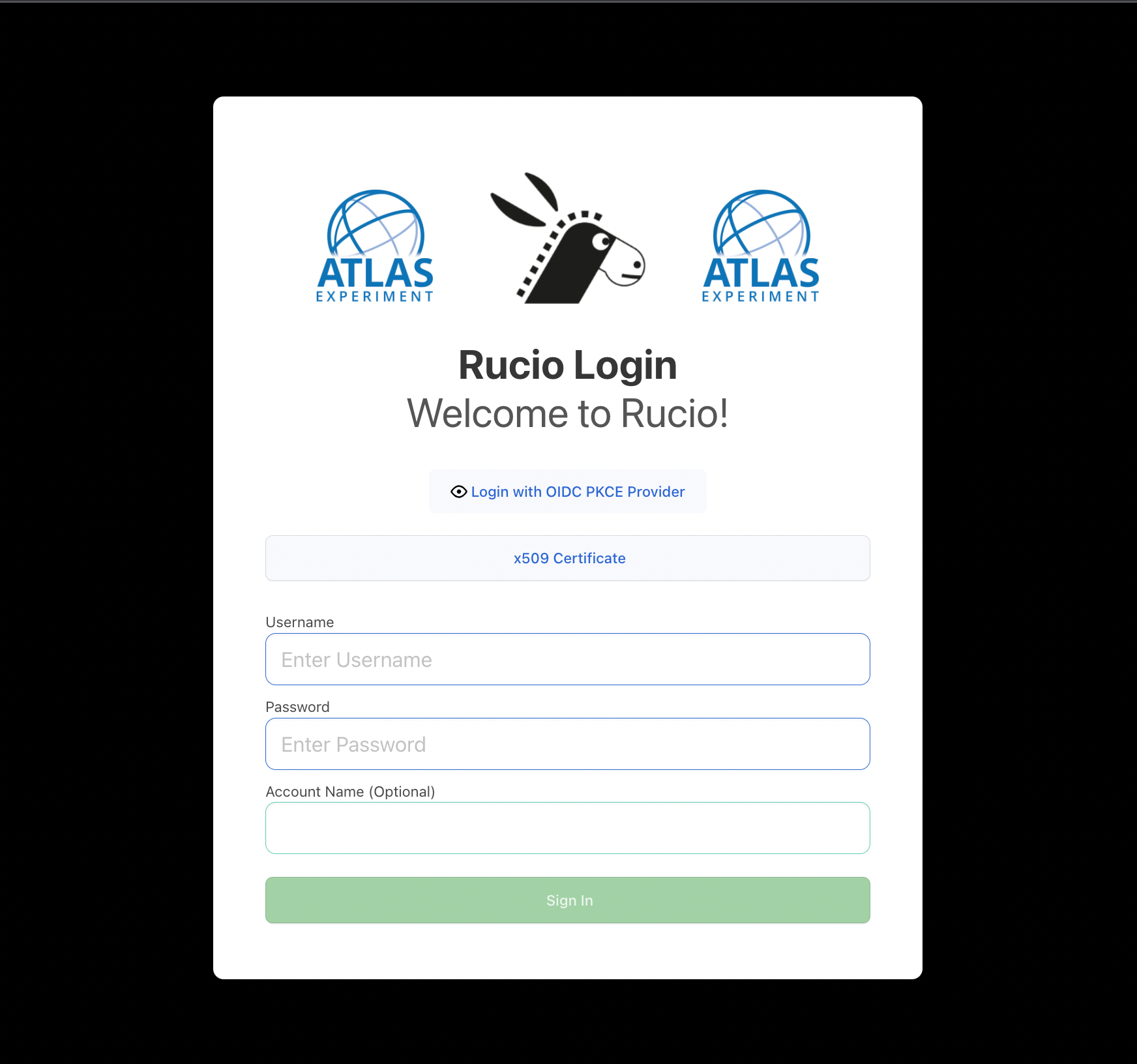
The Login page serves as the entry point to the entire application. It makes use of the custom built Form component, which supports field validation. It handles multiple auth mechanisms such as Username/Password, x509 ceritficate, OIDC & OIDC PKCE. A successful sign in leads us to the Home page, while the user is notified in case of an unsuccessful one.
Dashboard/Home Page
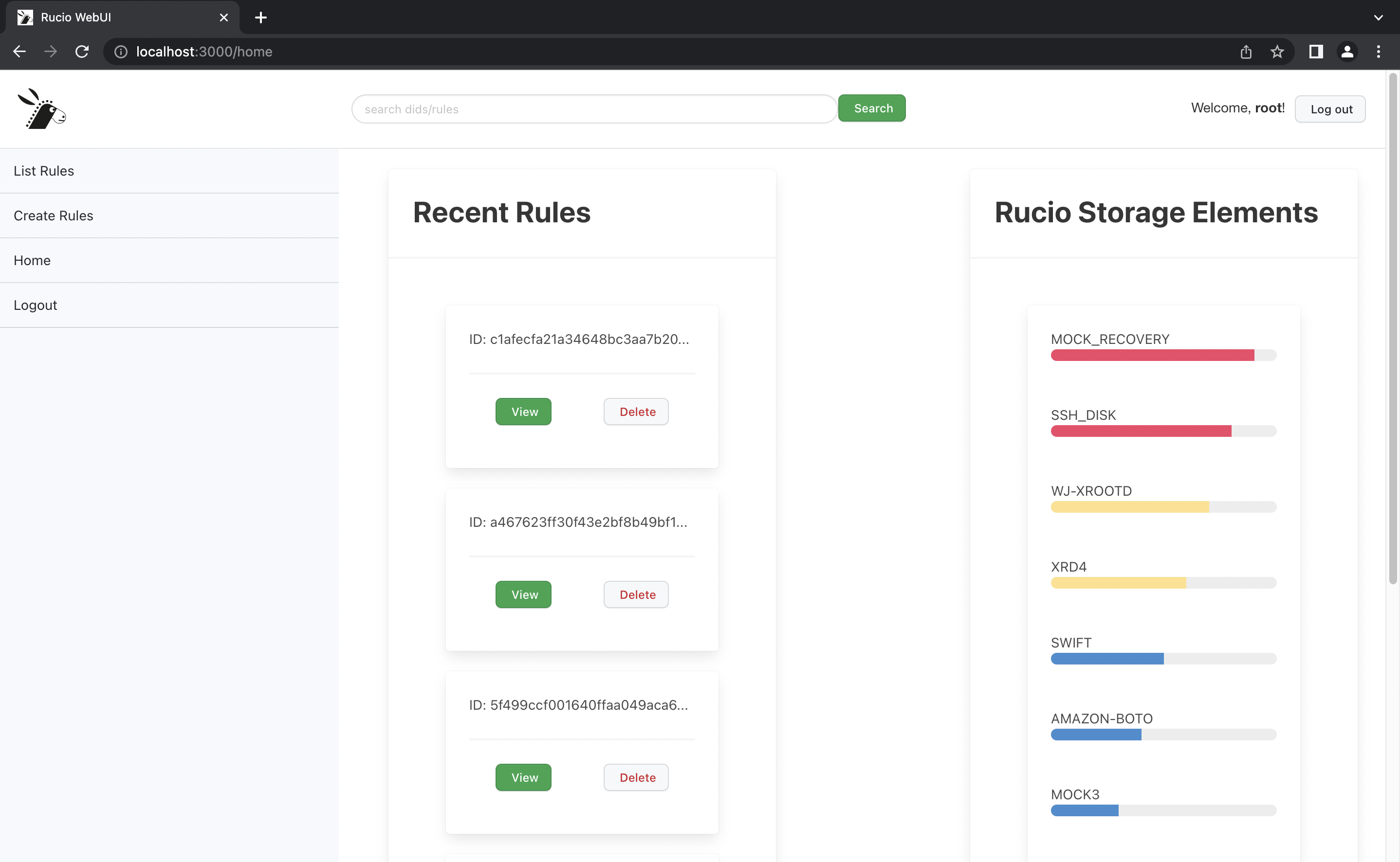
The Dashboard is the newest addition to the Rucio WebUI. This view currently supports displaying the most recent rules & RSEs along with their respective usages and quotas. On the left is the new redesigned (decluttered) Navbar, which supports easy navigation between multiple views.
DID Metadata Page
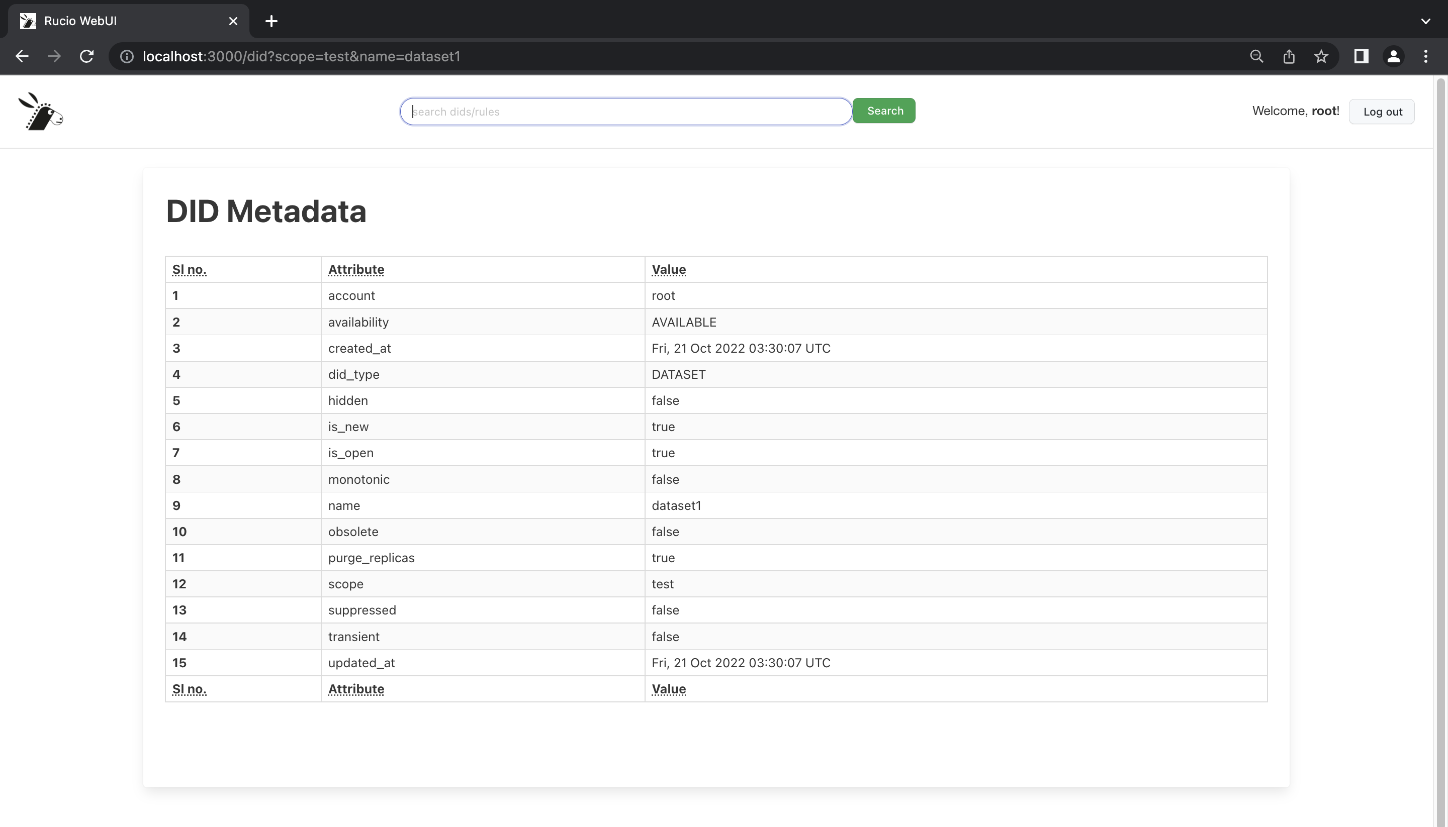
The DID Metadata page displays the different attributes associated to a DID, which a user can request to be shown by clicking an info button.
Rule Metadata Page
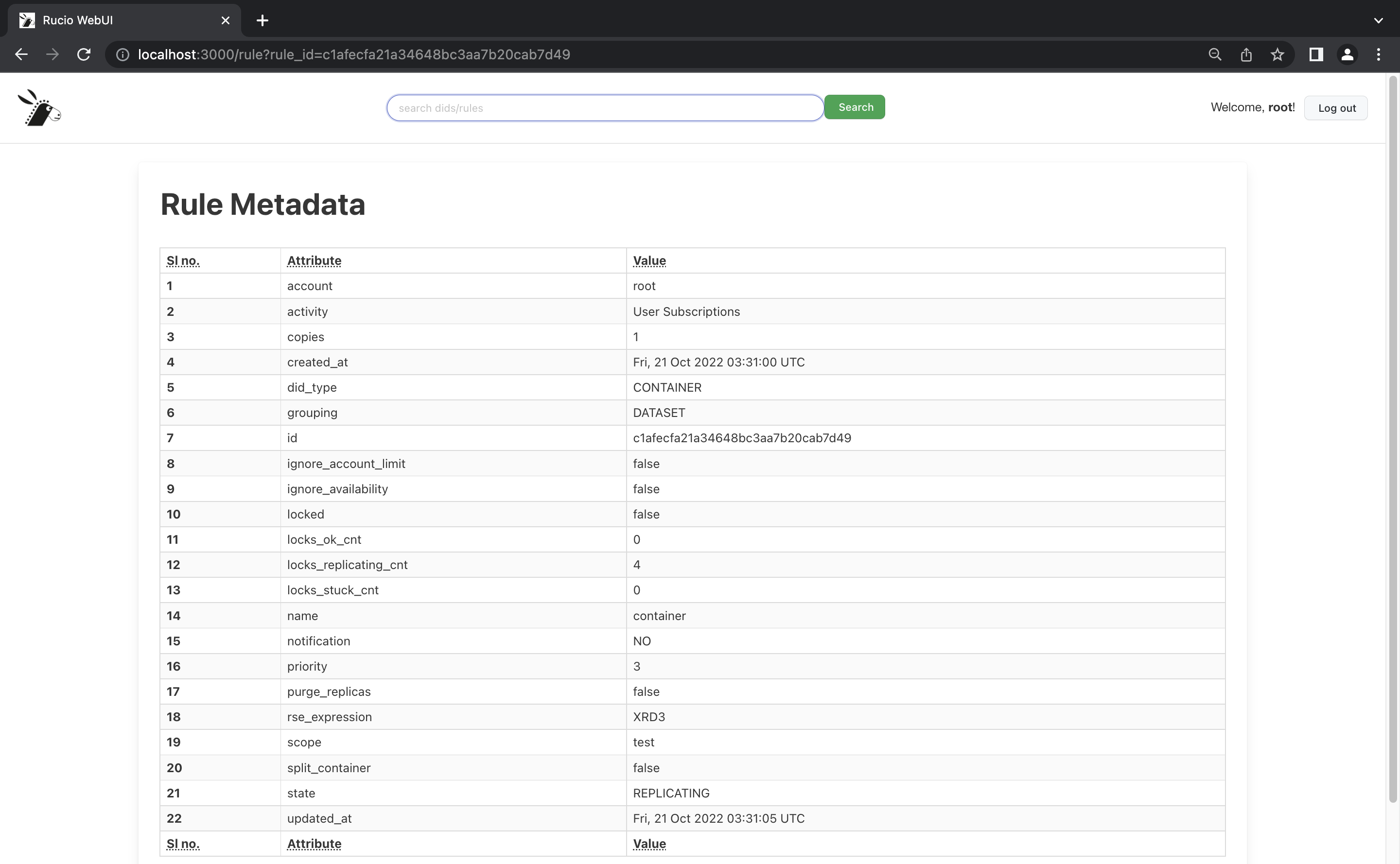
The Rule Metadata page displays the different attributes associated to a Rule, which a user can request to be shown by clicking on the scopename in blue.
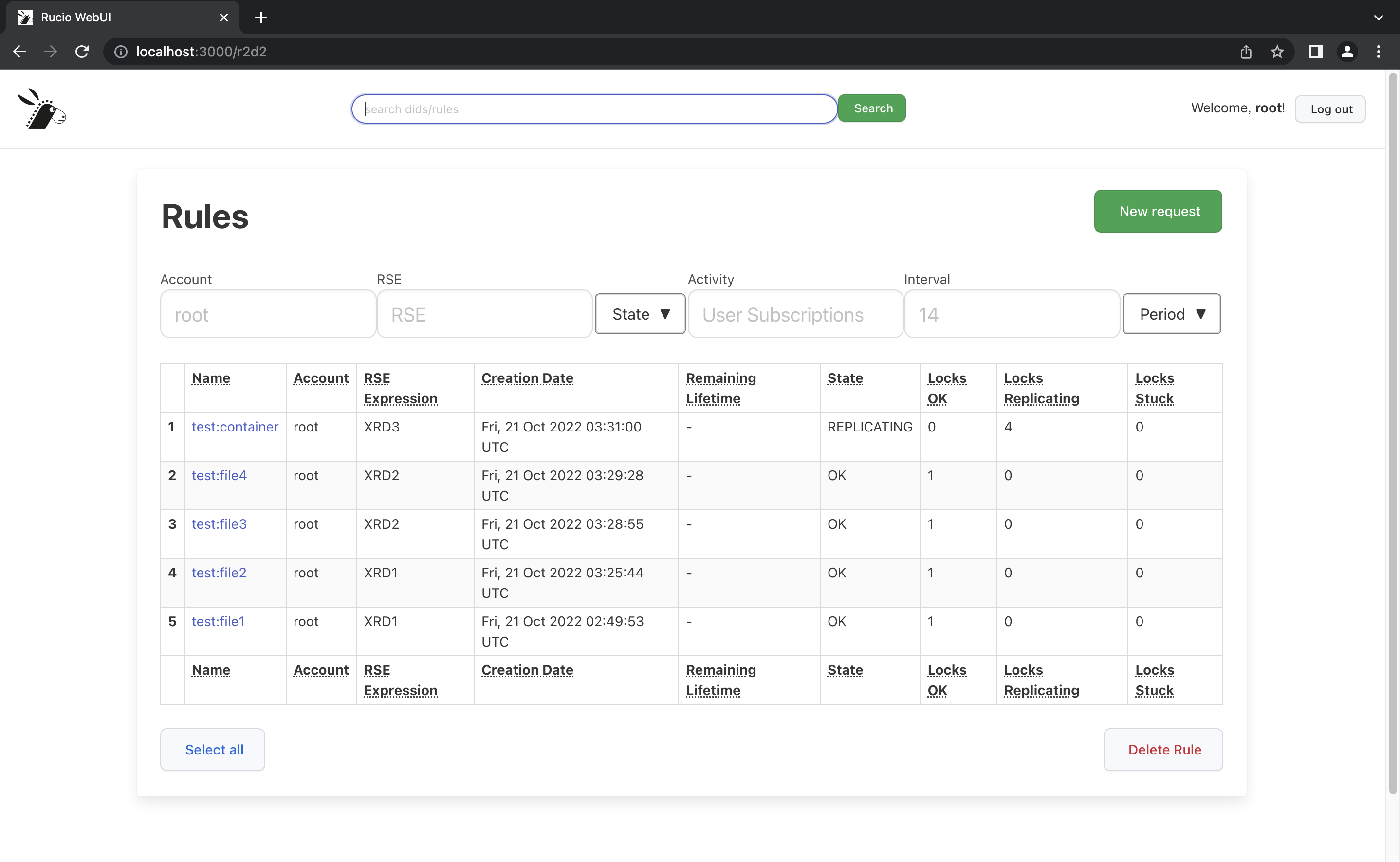
List Rules Page
As the name suggests, this page enlists all the rules associated to a given account, and provides options to take actions on them. This is largely enabled by the Table component and different filters provided at the top. Also present on the view are buttons to delete and create new rules, which redirects us to the Rule Definition page.
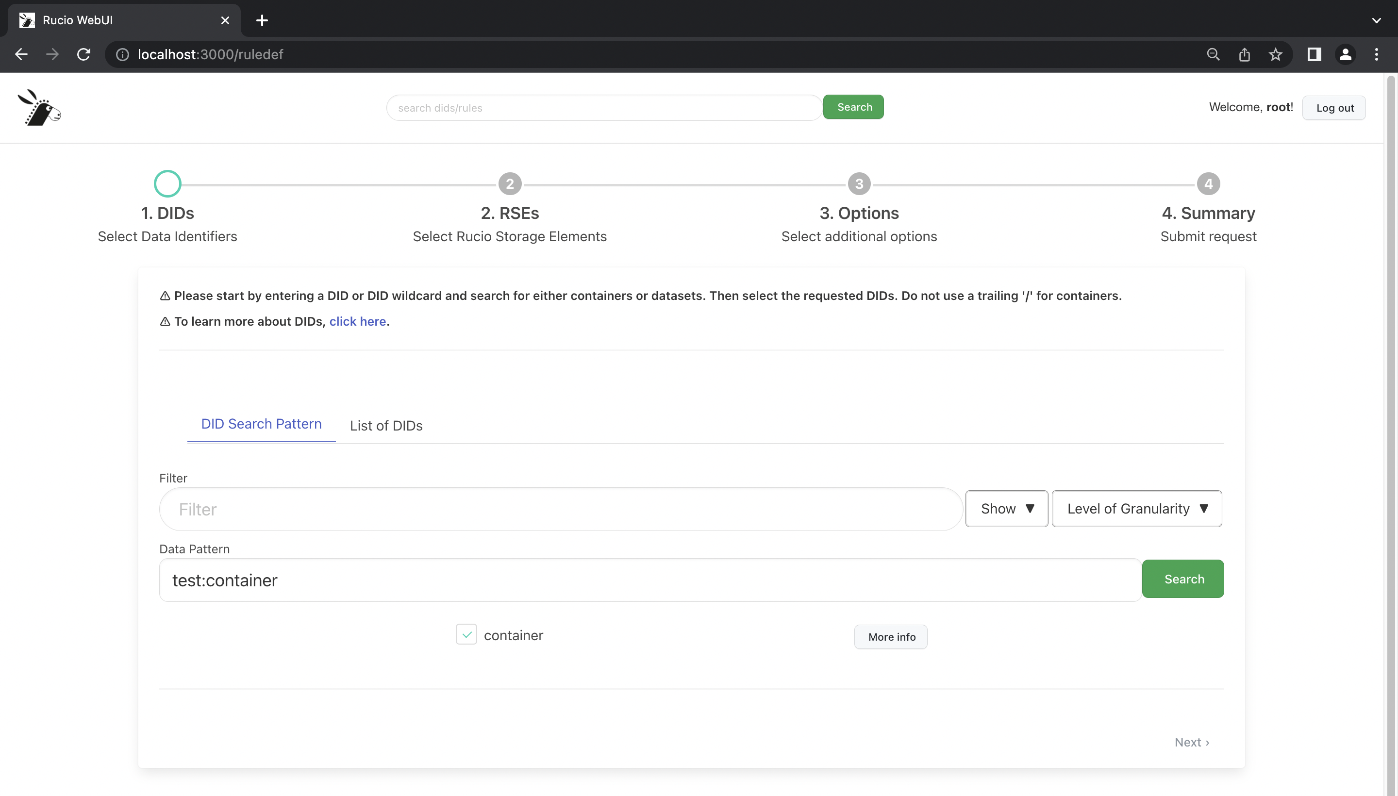
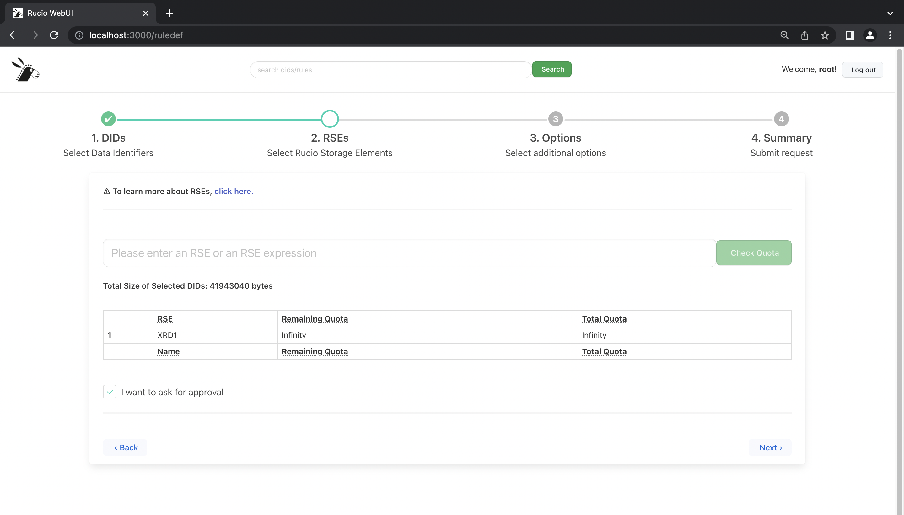
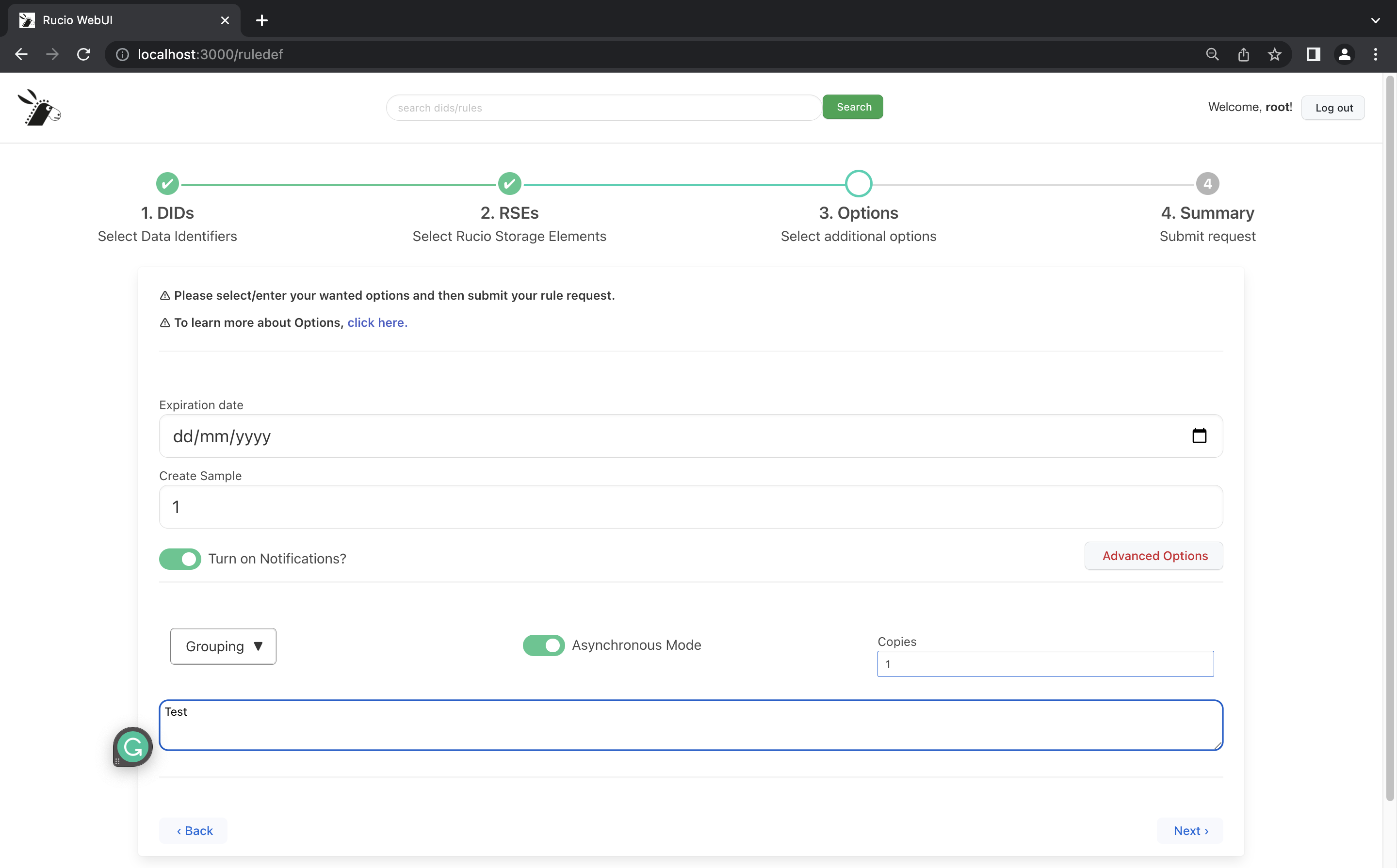
Rule Definition / Create Rules Page
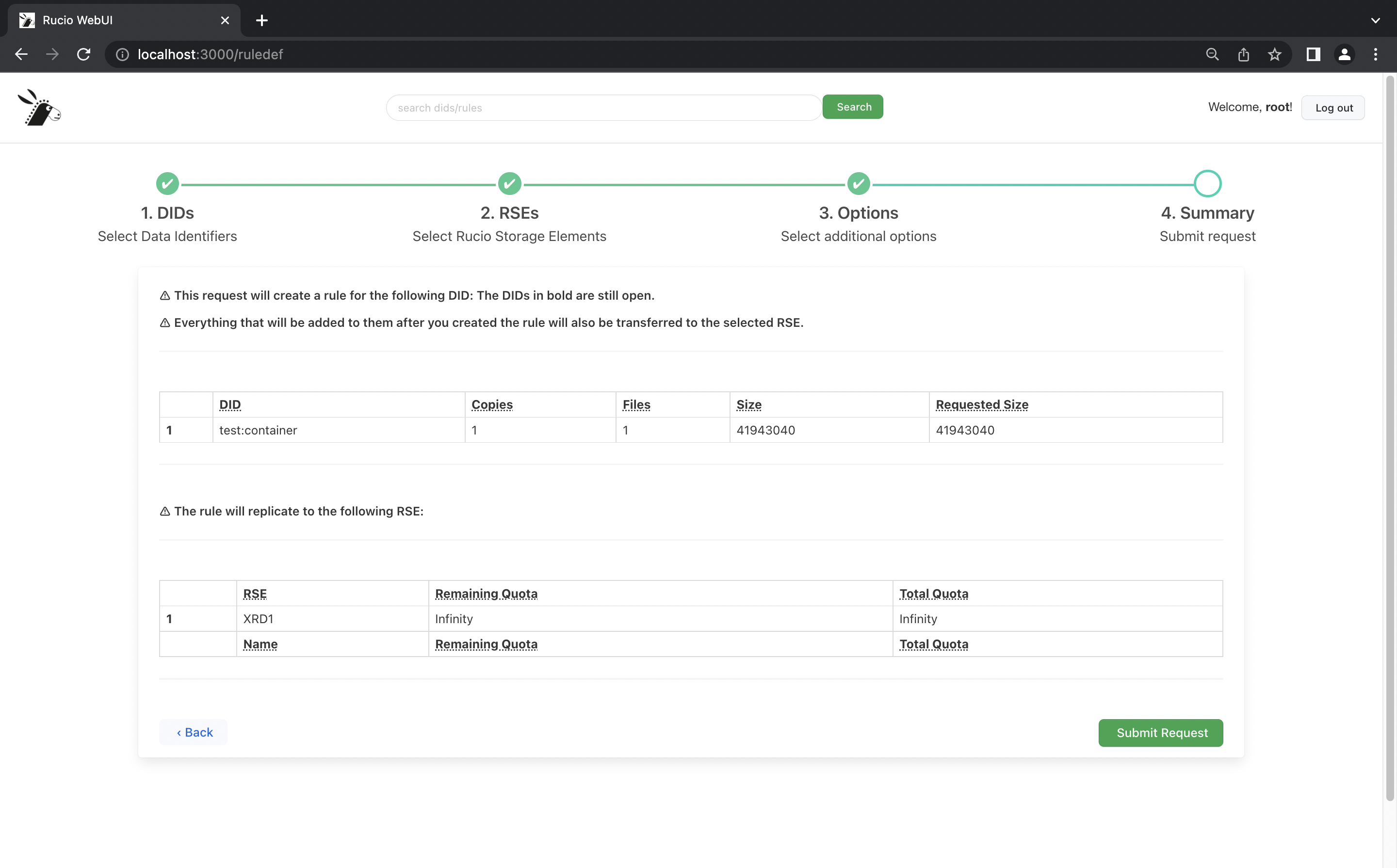
Central to the functionality of the Rucio WebUI is the ability to create rules with just a few clicks. Once a rule is created, the rule automatically reflects in the List Rules page, owing to the implementation of the global store using the React Context API.
Thanks to the foundational work done by @elizabethh777 for this page, I was able to get the end-to-end flow working post some refactoring. This included swapping out direct fetch calls with RucioClient, stronger type definitions, and CSS changes.
Step 1:
Step 2:
Step 3:
Step 4:
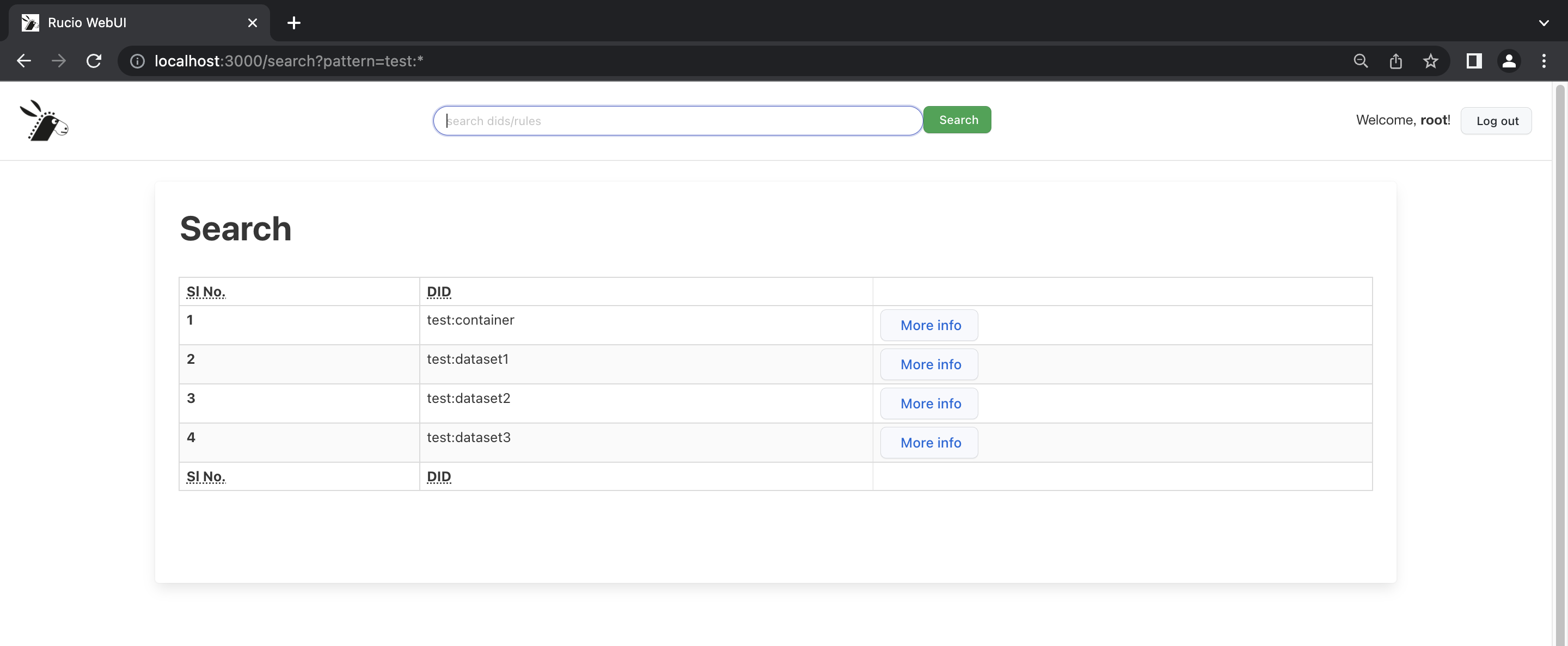
Search Page
On every page of the new WebUI, there is a Header containing the Rucio logo, on the click of which the collapsible drawer Navbar expands. To the right we have an option to log out of the UI. In the centre we have a Search field, which allows us to search for DIDs / RSEs from anywhere within the application. This redirects us to the Search page, containing tables to show the relevant information.
Error Boundary Page
The Error Boundary page serves a good purpose, that in the advent of an error/exception, it gracefully shows the error in a separate page, which signals to the user that there is an issue with the application at the moment. Without Error boundaries, the webpage would throw up a plain white screen as React unmounts the entire DOM. The Error boundaries serve another purpose - a component backed try-catch allowing us to log any anomalies into a monitoring service.

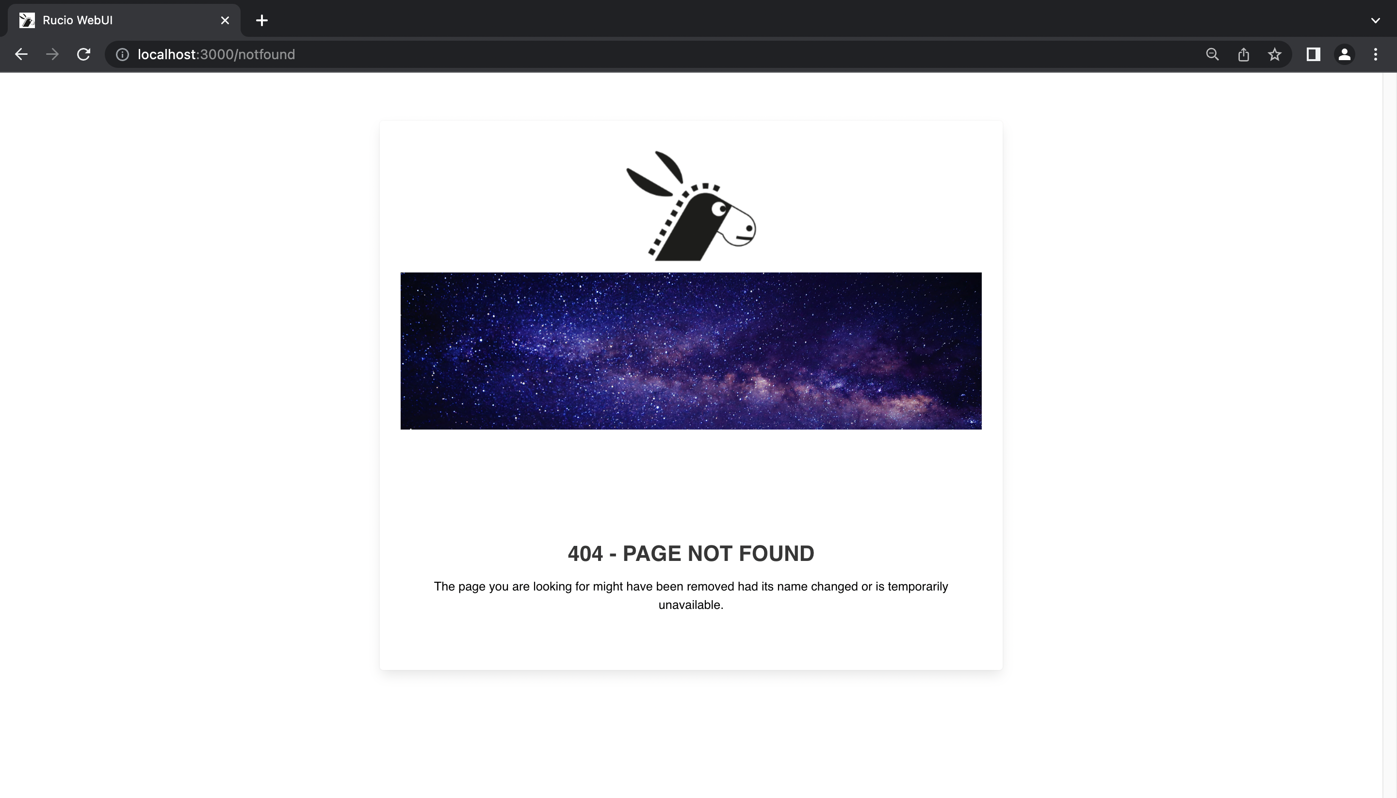
Not Found Page
If a user accidentally tries to access a route which is not configured, then a Not-Found (404) page is shown.
Key Stack Upgrades
The new WebUI has been developed bearing in mind the tech scenario for years to come - using technology and tools available which will serve us good for over a decade.
JavaScript → TypeScript
WebUI 1.0 used static JavaScript files, but the new WebUI uses TypeScript (.ts) and TypeScript extended (.tsx) for stricter type checks and greater flexibility. The project contains a rucio.d.ts file which declares all the types. Furthermore, there are Models present, which in combination with the RucioClient enable a stronger type-checked core codebase.
HTML → React
React was the preference when it came to picking a modern new-age frontend system for WebUI 2.0, owing to its stability and popularity. Alongwith storybook, react enabled a large-scale application wide code re-use, and helped develop multiple pages in a short span of time.
CSS → SCSS
Sassy CSS (SCSS) was the preferred choice over the regular CSS as it provides a bunch of functionalities making the development a lot easier. Bulma and Primer CSS libraries provide SASS files out of the box, which were leveraged while building Rucio flavoured React components.
Webpack
Thankfully for us, CRA (Create React App) internally uses webpack, which is leveraged by react-scripts to spin up builds. This is a significant improvement, as we benefit from webpack functions like Tree shaking.
REST’ful approach
The old WebUI had a direct DB dependency, which is a security debt. With the new WebUI 2.0, this direct DB dependency is completely removed, owing to its REST’ful architecture.
Key features
Authentication
The new WebUI 2.0 supports several authentication mechanisms. In the older UI, x509 authentication was pretty straightforward, as gaining access to the TLS socket could be done via the UI itself, but since the newer UI we follow a REST’ful mechanism, this was a bit of a challenge. Eventually, this was handled with a different deployment strategy.
The OIDC mechanism was handled effectively thanks to a couple of readily available open source npm projects. As a improvement, the newer UI supports OIDC PKCE, which is a preferred alternative over security concerns and not having to embed values of client secret in the environment variables.
The Username / Password auth was the one which was cracked first. There were some CORS issues faced during the implementation, which required server side changes.
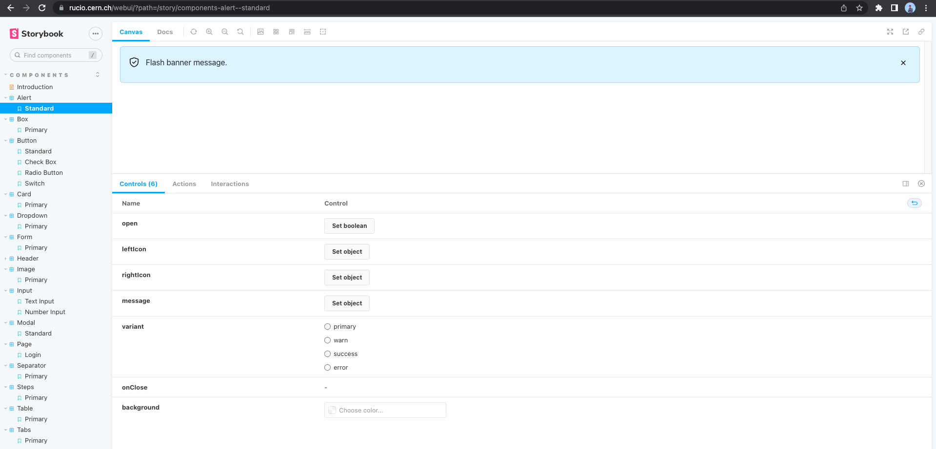
Storybook Components (x15)
Storybook is great for documenting UI components. The same was used to document and build close to 15 different components, ranging from input fields to cards to tables.
Thanks to @elizabethh777, several of these components were built by looking at the previous foundational components built by me. During the refactoring, some tweaks were added in to make all the components look more in sync.
Rest API Wrapper
The browser fetch api is wrapped around with 5 utility functions, namely getData, postData, putData, deleteData and streamData. Furthermore, the server base url & Rucio auth token are automatically inserted into the request, making things look much cleaner in the React pages.
Rucio Client
The Rucio Client is an important piece of abstraction, playing a vital role in terms of code readability and error handling. The Rucio client is single handedly responsible for reading any configuration, calling the restAPIWrapper to make the fetch call, receiving the response, throwing custom exceptions if necessary, and finally parsing the response. To prevent promises from being thrown around in the application, the callback mechanism of JavaScript was leveraged well.
SCSS Architecture
The SCSS architecture in the new WebUI 2.0 is unconventional, but serves a mighty purpose - to have the ability to build our own components on the fly, or use out-of-the-box SCSS to style existing components. As a result, Rucio flavoured components are now a reality.
Configuration & Environment Variable Control
To get a different flavour of the application itself, many of its features are controlled by environment variables and driven by configuration.
Custom Exceptions
Some exceptions thrown by either the code or received in response from the server will need to be classified and an appropriate alert must be shown to the user. To aid this, alongwith the regular HTTP error codes and messages, WebUI 2.0 supports throwing custom exceptions and errors, which get gracefully caught in the catch block just like other regular errors.
Navigation + Search
The left side bar navigation brings in a new dashboard-like flavour to the WebUI. The Search bar on top has been preserved as is in terms of functionality.
Protected Routes
react-router-dom has been configured to handle protected routes, and allow only authenticated users to access certain protected routes. In case of an invalid access the user is redirected to the Login page.
Global Store
Making use of the React Context API, a global store is available. This implementation creates a context, which could be used to access the global store from anywhere within the application. An updateStore function is provided to publish updates to it. This causes any component subscribing to the store to update itself with the fresh props.
Alert + Modal Hooks
Since alerts/modals can be shown from anywhere within the application, special purpose-built hooks were developed, which can be instantiated and called. No additional imports are necessary - the content that these popups display is entirely customizable as well.
Responsive
Mockups were built both for the desktop and mobile versions. Care has been taken from Day 1 to build views that were fully responsive.
Best Development Practices
CI/CD
Custom CI/CD was in place since the first week of the project. It not only builds both the React app & Storybook app, but also deploys Storybook to GitHub pages after a successful merge to master.
Code Structure
Types, Models, Exceptions & REST Wrapper not only gave birth to the RucioClient, but also enabled a cleaner and more readable codebase. The storybook components sit neatly within the stories folder, and the React pages sit within components.
Code Quality
On top of type checking, variable usages are null-safed, object and array destructing is in place wherever necessary and exceptions are handled appropriately.
Unit Testing
Using the react testing library, Unit Testing has played a crucial role in building a resilient and bug-free codebase. While there is a lot more ground to cover in terms of coverage, the ability to test at a component level will greatly simplify the overall testing.
Accessibility
a11y plays a pivotal role in determining if an application caters to audience of all forms. Using WAVE and other accessibility tools, there has been a solid attempt at improving the a11y score of the website since the day the first page was complete.
Relevant PRs
-
Replaced localStorage with sessionStorage, “any” with “unknown”
-
Feature 37 Implement environment layer, add OIDC configuration, other cleanup
-
Initial Setup of Storybook, React App, CICD deploy to GitHub pages
Key Takeaways
- Having the right mentors are key to any project - a huge shoutout to @maany, @Martin & @Cedric! (special mention to @elizabethh777 for parterning with me on this project!)
- Creating an OSS project from scratch having a huge impact has been a dream of mine, and I think I very well might’ve done it!
- Rethinking UI really requires you to step out of your developer shoes and don the product hat.
- Being passionate about something really drives you to do it consistently.
- While the GSoC period ends here, contributing to OSS should continue!
Pending Tasks
- While the High priority pages were migrated, the Medium and Low priority pages are yet to be migrated.
- There may also be some more thought put into how the token refresh should happen.
- The Logout mechanism implemented currently is very simple, but there would be additional complexities coming in once we get some input from our users.
- Accessibility and Responsiveness would require multiple iterations as and when new views are implemented.
That’s it for now folks. Adios!